By Sonia — Content Writer at Creativ Deziners
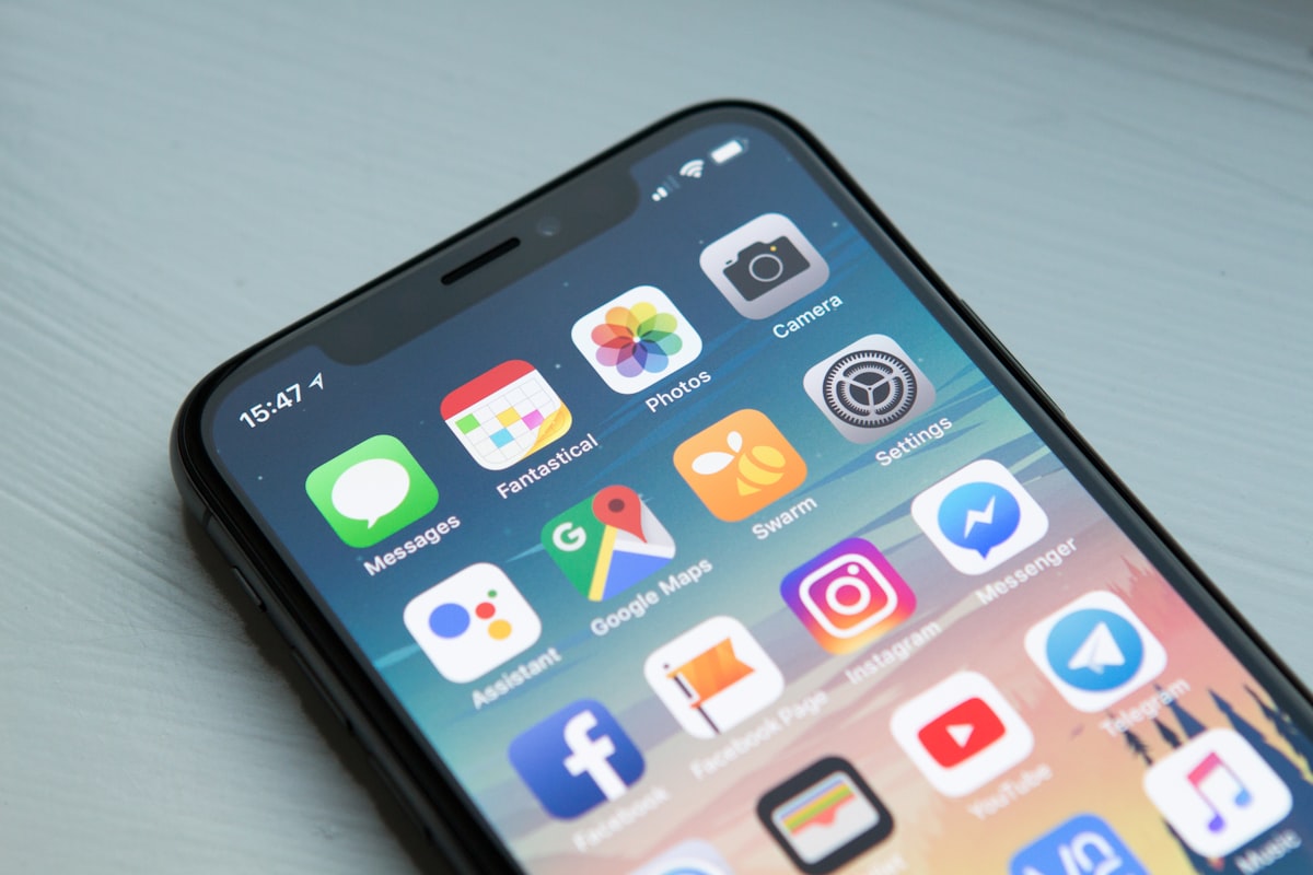
More than 60% of web traffic now comes from mobile devices. If your website isn’t optimised for phones and tablets, you’re potentially losing more than half of your potential customers. Adopting a mobile-first design approach is no longer optional — it’s essential for any business that wants to stay competitive online.
What Is Mobile-First Design?
Mobile-first design is a web development strategy where you design for the smallest screen first and then progressively enhance the experience for larger screens. Instead of shrinking a desktop site down to fit a phone, you start with the mobile layout and add features, content, and complexity as the viewport grows. This approach forces you to prioritise what truly matters, resulting in cleaner, faster, and more focused websites. By putting mobile users first, you ensure that your core content and calls to action are front and centre on every device.
Google Prioritises Mobile-Friendly Sites
Google uses mobile-first indexing, meaning it primarily uses the mobile version of your site for ranking and indexing. A site that isn’t mobile-responsive will struggle to rank well in search results. Embracing mobile-first design directly supports your SEO efforts because Google rewards sites that deliver a great mobile experience. If you want to understand how thoughtful design impacts your overall online presence, read our guide on why UI/UX design is crucial for website success.
How Mobile-First Design Improves User Experience
People browsing on phones are often on the go and looking for quick answers. Your mobile site should prioritise key information: contact details, opening hours, and clear calls to action that are easy to tap with a thumb. A mobile-first design naturally leads to better usability because it eliminates clutter and focuses on the essentials. Faster load times, legible text without pinching, and tappable buttons all contribute to a smooth user journey. Learn more about how user experience design boosts conversions and turns visitors into loyal customers.
Mobile-First Design and Business Growth
A well-executed mobile-first design doesn’t just look good — it drives real business results. Mobile shoppers are more likely to complete a purchase on a site that loads quickly and is easy to navigate. Every second of delay can cost you a sale. By designing for mobile first, you create a frictionless experience that encourages engagement, reduces bounce rates, and increases conversions. For a full checklist of what your site needs, check out our post on essential features for a small business website.
One Design, Every Device
The best approach is responsive design — one website that adapts seamlessly to every screen size. This ensures a consistent experience whether your customer is on a phone, tablet, or desktop computer. A mobile-first design philosophy ensures that this responsive experience is built on a solid, user-centred foundation.
Get Started Today
Is your website mobile-friendly? If not, CREATIV DEZINERS can help. We specialise in building fast, beautiful, mobile-optimised websites that your customers will love. Chat with us on WhatsApp to discuss your project, or email hello@creativdeziners.co.uk. Let us help you implement a mobile-first design that grows your business.
About the Author
Sonia — Content Writer at Creativ Deziners. Specialises in SEO content, brand storytelling, and copywriting for Scottish businesses.